Kelty
UX Case Study
by Jason McCabe
Project Overview
The product
Kelty is a leading manufacture of backpacks, tents, sleeping bags, camping furniture and other outdoor gear that is built to last.
Project duration
January - March, 2024
The problem
The existing site is difficult to use and doesn't deliver an on-brand experience to our audience. .
The goal
Deliver desktop and mobile websites that include the user as part of the brand experience. Make it easier for them to purchase
Kelty Gear.
My role
UX Designer
Responsibilites
My responsibilities were global throughout the project and included competitive research, user research, personas, user journeys, affinity map, wireframes, Lo-Fi prototypes, usability studies, mockups, Hi-Fi prototypes, accessibility considerations, testing, design iteration, etc.
Understanding
the user
• Research summary
• Pain points
• Personas
• Problem statement
• Journey maps
• Affinity Diagram
User research: summary
In order to gain a deep understanding of the users I am designing for and their needs, I conducted interviews and developed empathy maps. Through my research, I identified a primary user group representing three user types: first time camper, avid camper and occasional long time camper. While these individuals confirmed some initial assumptions about Kelty customers, a deeper dive uncovered additional user issues simply improving the purchasing flow. These issues included need to know what equipment was best what specific purpose, climate and time of year as well as the necessity to inform users about product they might not think they need but would greatly improve their camping experience.
User pain points

Usability
It's difficult for users to find what they are looking for and the purchase process is clunky on our existing site.

Accessibility
It is difficult to add alt tags to every image.

Trust
When users find it difficult to navigate the site and make purchases they loose faith in the brand.

Disorganized
Users need an easy way to easily find product and complete purchases.
Persona: Dan

Statement
“Now that I'm making decent money I'm replacing my old cheap gear with some good stuff ”
Dan is a single man (with a steady girfirend) in his early 30's. He goes camping several times a year with a group of friends. These trips are important to him.
Background
Age: 32 Education: College Graduate
Hometown: Sacramento, CA
Family: Single - has a girlfriend
Occupation: Digital marketing
Goals
• Treat people well
• Be good to the enviorment
• Have fun
• Get another promotion
Frustrations
• The gear he s feels low quality
and doesn't perform well
• He probably needs more gear
for a better experience
Problem Statement

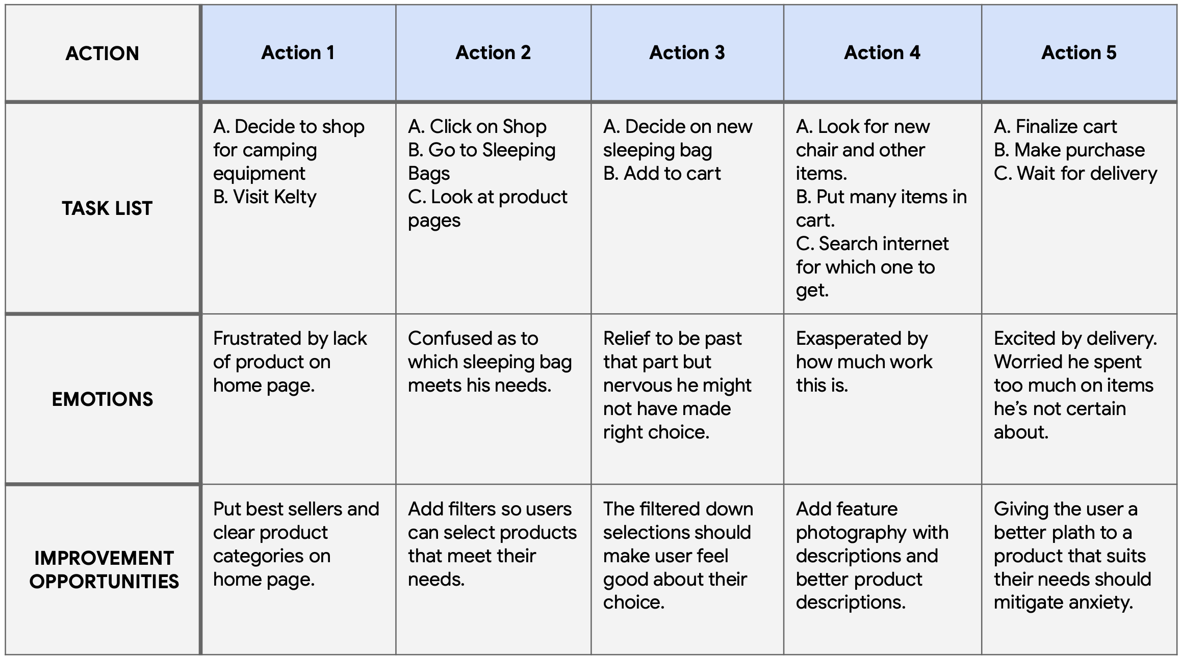
User Journey Map
Affinity Diagram
Key pieces of information from the user interviews was used to create an affinity digram. Data was organized into groups of pain points which were further organized into high level goals for improvement.
Starting
the design
• Digital wireframes
• Usability studies
Paper Wireframes
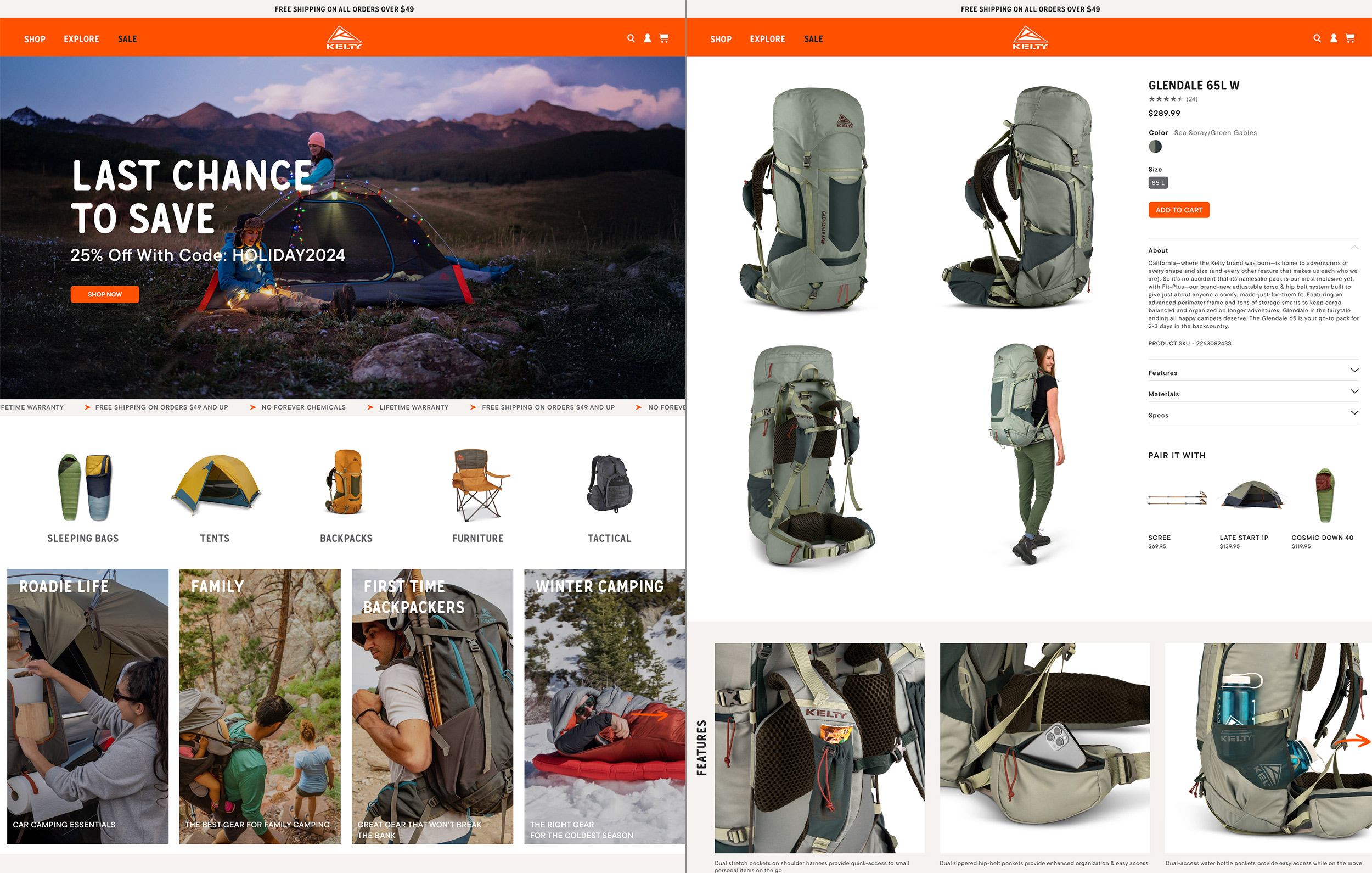
Demonstrating that there are lots of great recipes to choose from on the home screen was very important. Drafting different design options on paper provided a quick way to to compare and decide on the best design to use in the digital wireframes.

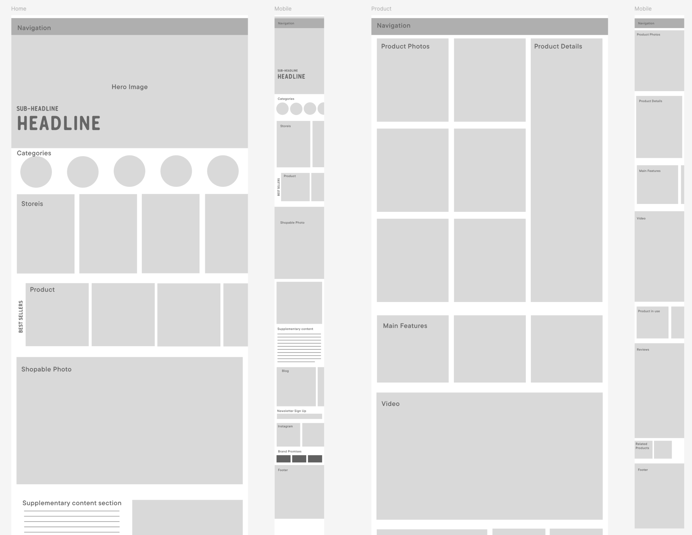
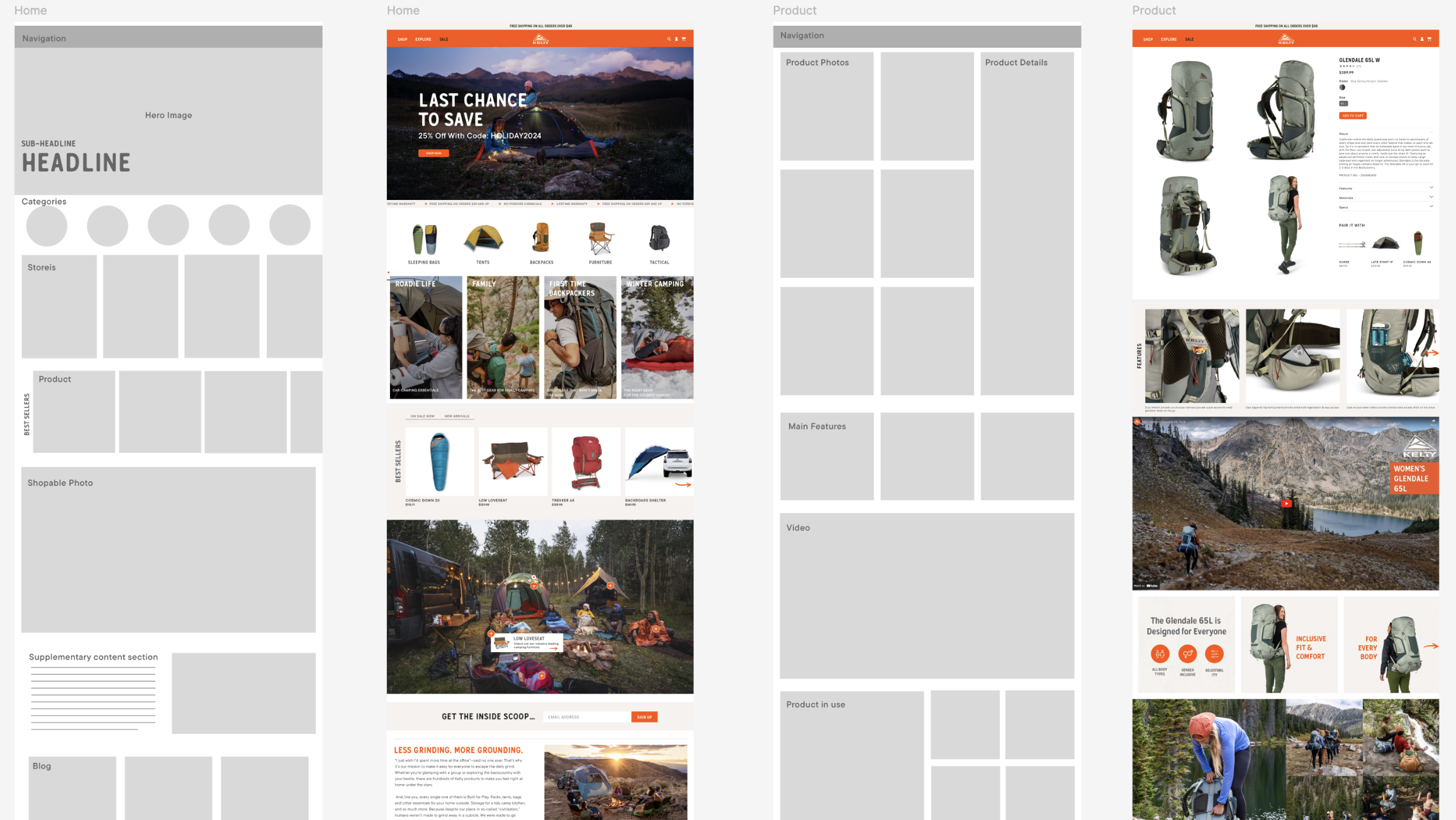
Wireframes
The goal was to create a UI that provides the user with the option to choose the path that best serves the individual.
Low-fidelity prototype
The home screen provides thumbnails of the most popular recipes. Easy navigation to recipe categories is imperative.
View Lo-Fi Prototype
Usability study: findings
We conducted two rounds of usability studies. Findings from the first study helped guide the designs from wireframes to mockups. The second study used a high-fidelity prototype revealed what aspects of the mockups needed refining.
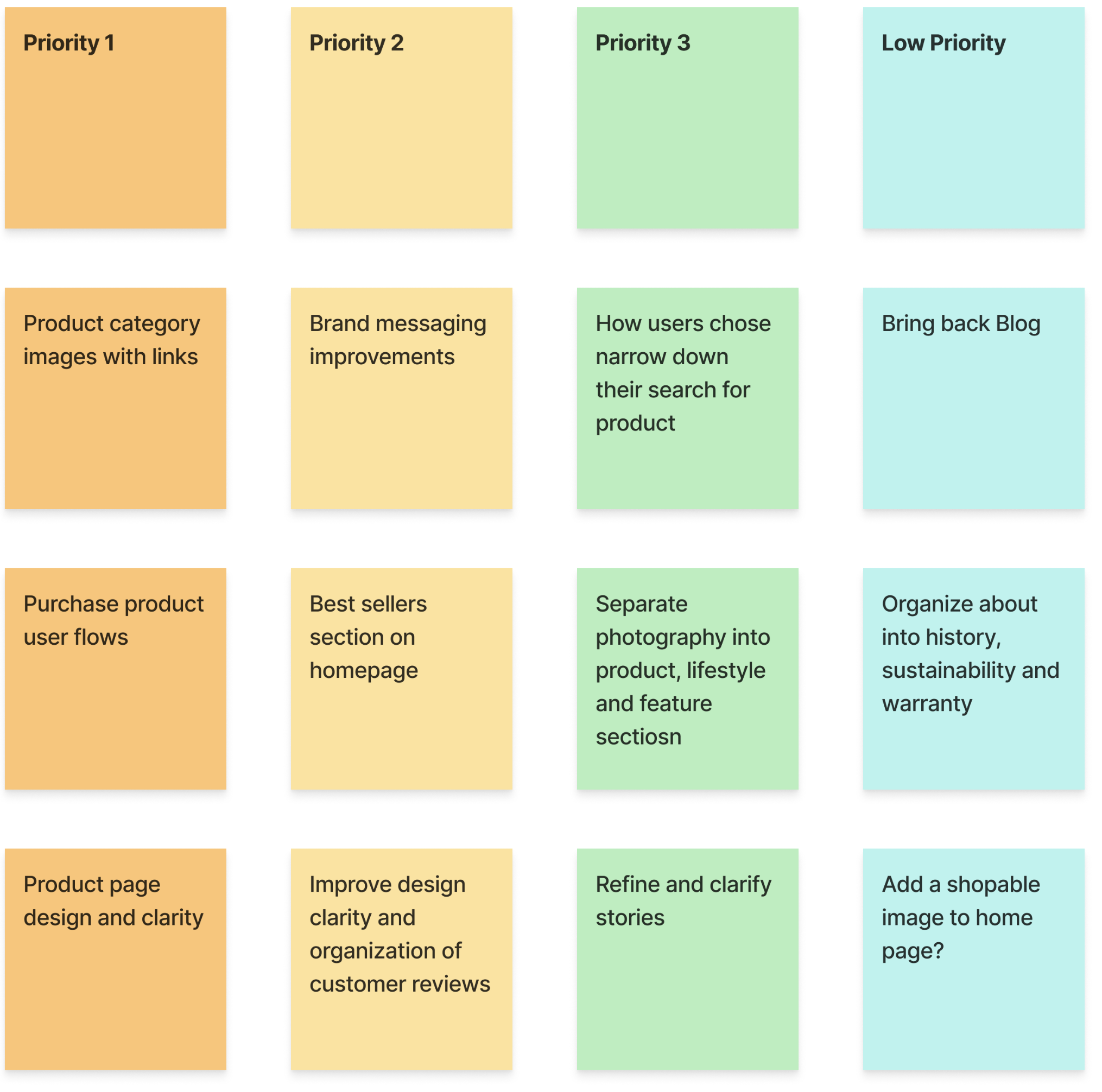
Round 1 findings
Users felt the product was difficult to get to
The brand messaging was muddy at best
Product pages lacked details
Round 2 findings
Finding the right product was still not easy
More on brand history might help
Features still not highlighted well enough
Refining
the design
• Mockups
• High-fidelity prototype
• Accessibility
Early Mockups of app
Users could not easily find recipe categories so they were moved from the search screen to the home screen. It was also decided that all recipes would be fast and easy to prepare, making them suitable for any night of the week.
Before
usability study

After
usability study

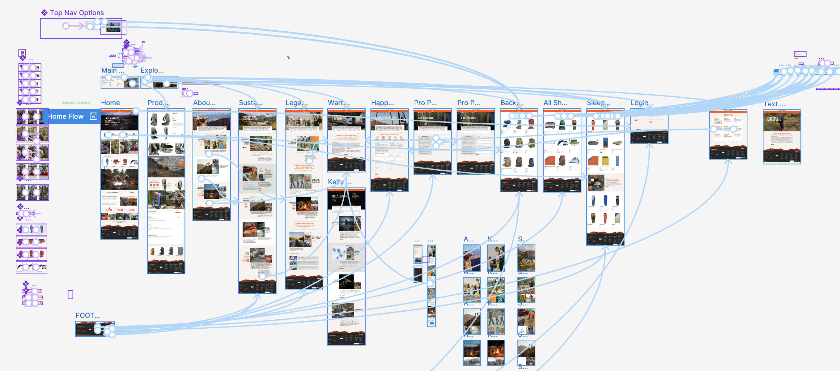
Wireframes to Hi-Fi mockups
Hi-fidelity Prototype
A clickable prototype was created in Figma. Through the use of category image links and robust filtering makes the right product easily accessible without using search or digging through traditional menus. The prototype allowed for early user testing and served as a useful tool for developers as the e-commerce site went into production.


Accessibility considerations
Fonts were checked to make sure size, style and contrasts meet standards of clarity for the visually impaired.
Alt text is added to images and graphic buttons for screen readers.
Consistent layouts and using the header tag system helps make navigating the site easier the visually challenged.
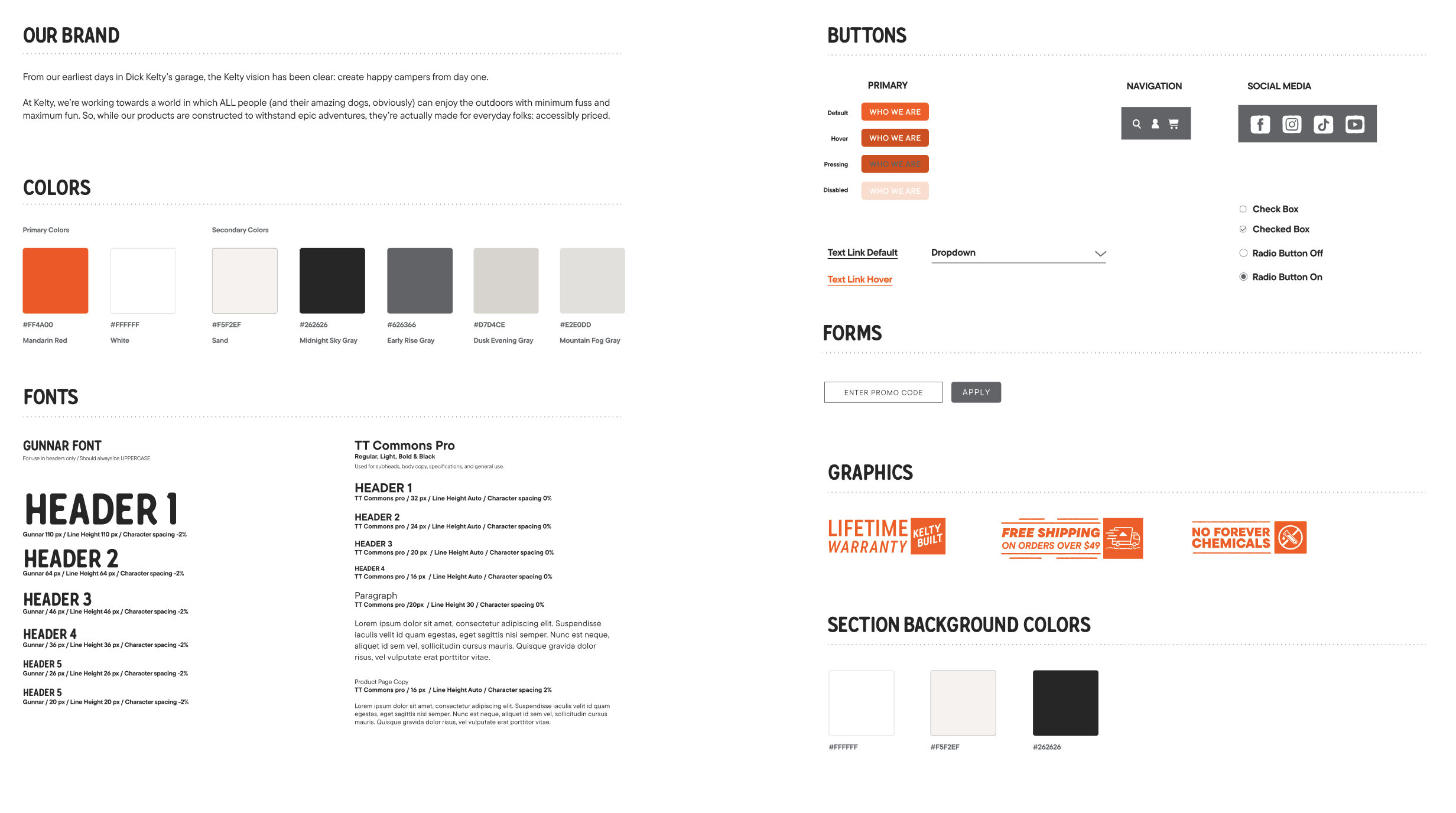
Style Guide
Going Forward
• Takeaways
• Thank you!
Takeaways
Impact
Improved user experience has translated into improved sales. "The new site is so much easier to use and looks great."
What I learned:
Looking through the users eyes helped identify pain points and create a site that gives users confidence in our product.
Next Steps

One more round of visual design
refinement as well as copy editing.

Conduct an additional round of usability studies to demonstrate whether existing issues have been addressed and no new pain points have come to surface.

If no issues are found it’s time to decide if the app is ready for development.
Thank you!
I appreciate your taking the time to review my work on Kelty.com
Reach out to me using the form below if you’d like to get in touch.
